Outside Portraits
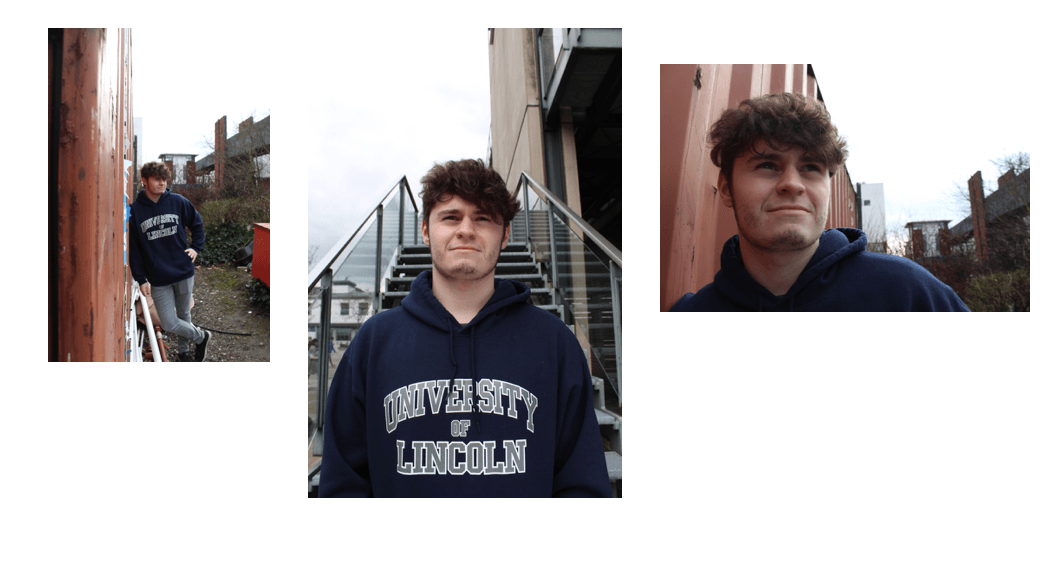
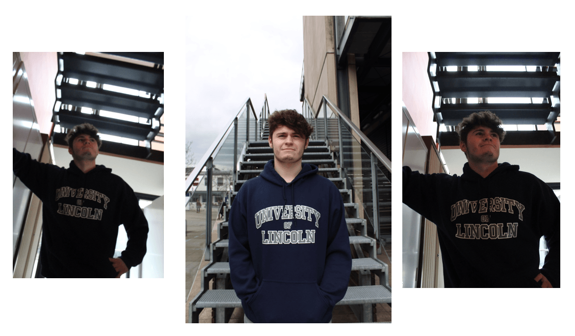
After shooting portraits outside of the photographic studio and without the benefit of LED lighting sources, I soon discovered it was much harder to achieve your desired lighting conditions for your portraits in a natural environment. As a result, we had to adapt to the environment by editing the ISO, the exposure and the shutter speed settings. In the bottom centre image, I tried to achieve a strong symmetrical image though framing of my subject and the placement of where he was in regards to the stairway.
Studio Portraits
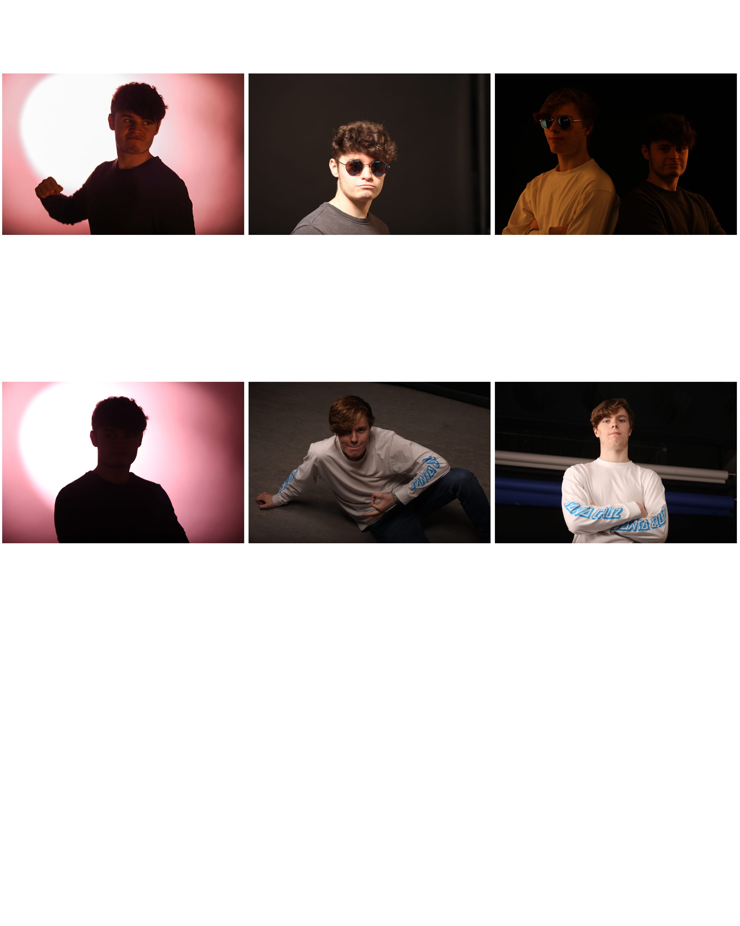
Here we experimented with lighting and backdrops with regard to portraiture in the studio. Ultimately, we explored high key and low key lighting, seeing how the image and subject was affected by each change. As you can see, we used low key lighting to achieve a warm-looking effect in the top right hand corner image, giving an aesthetic of yellow and red as the light is projected onto the white shirt especially. The images aren’t perfect, however they show how we experimented to find effective and uneffective lighting setups. The low level lights were achieved by a single spotlight shone onto a pink backdrop, acting as a backlight behind the subject. These images made Andrew a silhouette, only showing the outline of his body. For brighter lit shots, we decreased the ISO to darken the image and used a soft box either side pointing towards the subject, to achieve the orange, warmer aesthetic.
Project Intentions Form
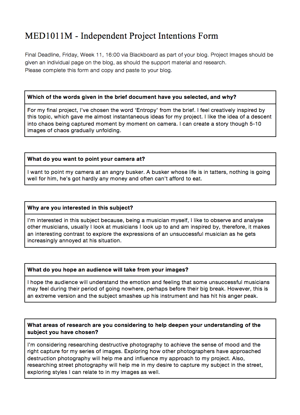
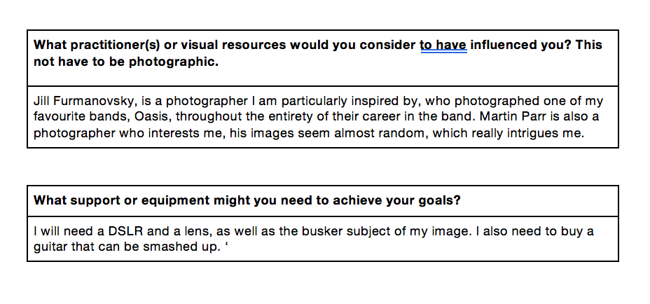
Here is my Independent Project Intentions Form, where I have briefly explained my ideas and inspirations for my project, where I will be focussing on the word ‘Entropy’.
Independent Still Life Project
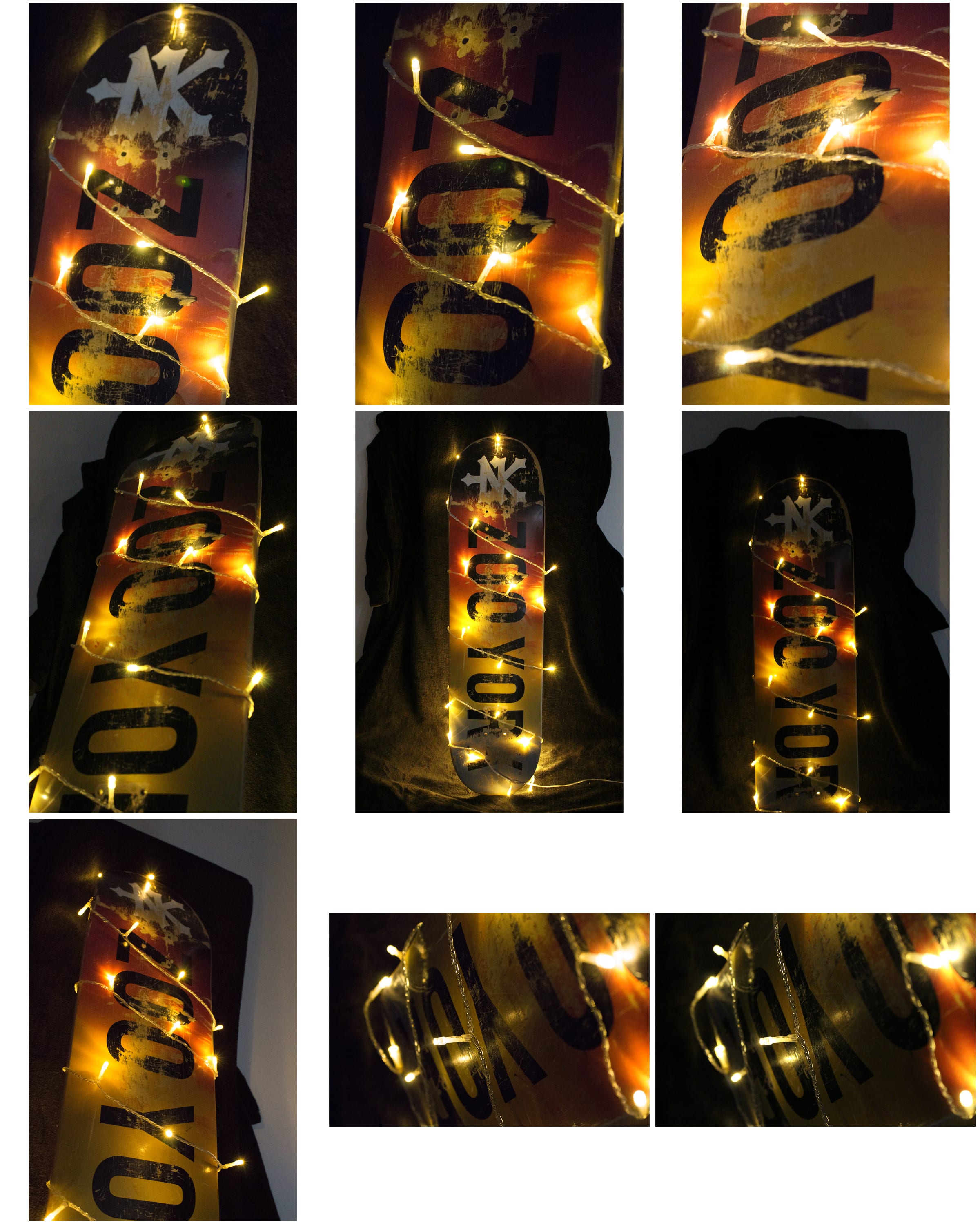
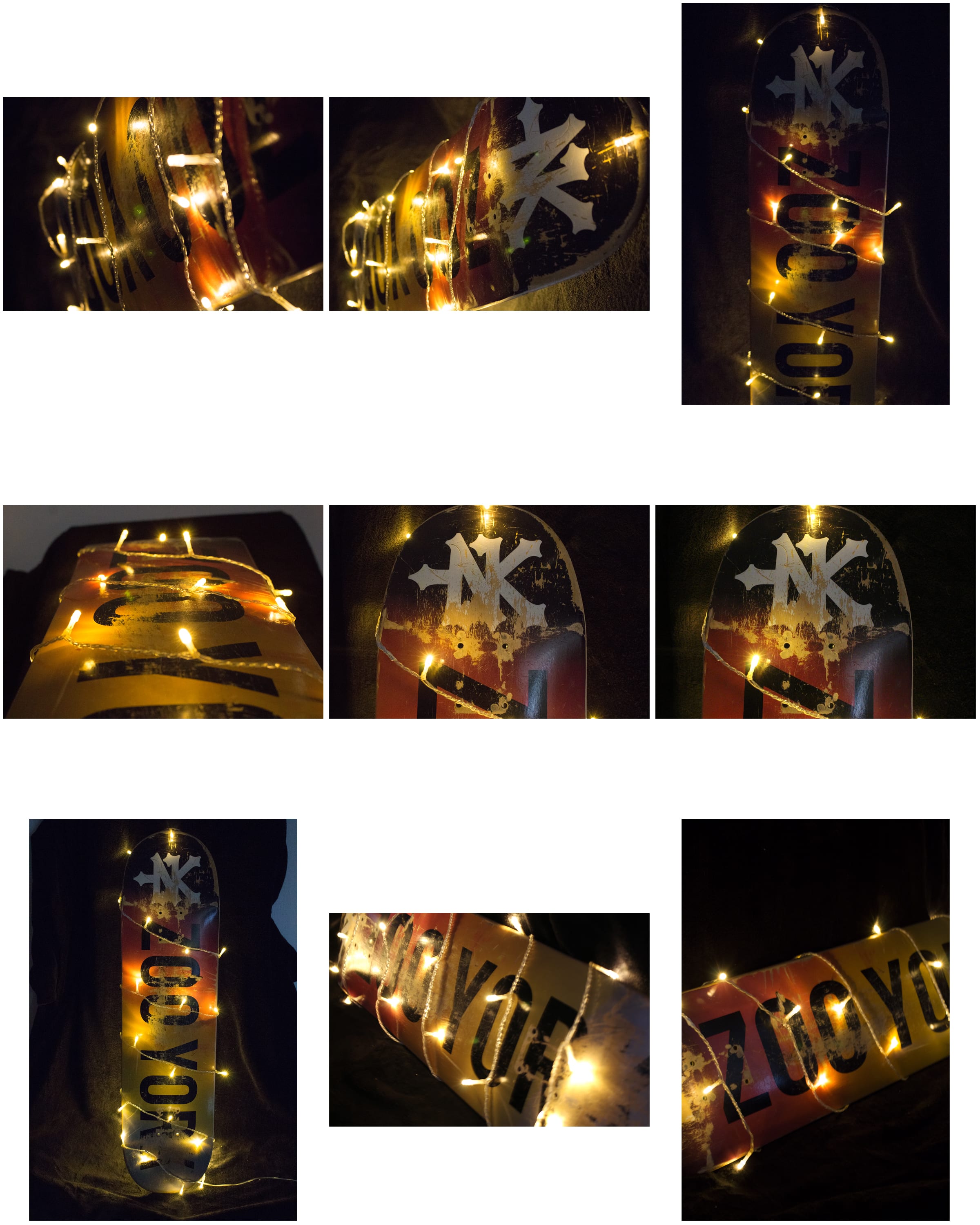
For my individual still life project, my found object was an old skateboard deck. Here I have included a wide range of images I chose, however each was individually selected especially from the vast range I had achieved post-shoot. I used a black blanket as a backdrop, to ensure the focus was on the object itself, and so the background wasn’t diverting the viewers eye away from the skateboard deck. I wrapped fairy lights around my object to make it glow and enhance the reds and yellows on the deck graphic. I believe this was successful and offers a nice aesthetic, continued throughout the selection of my images. I experimented with changing the ISO settings, both increasing and decreasing, as well as the exposure and the shutter speed to see what results I got. Occasionally I would obtain blurry photos after editing the settings, so eventually I was able to find good in-between settings which were appropriate for the images.
Still Life Workshop
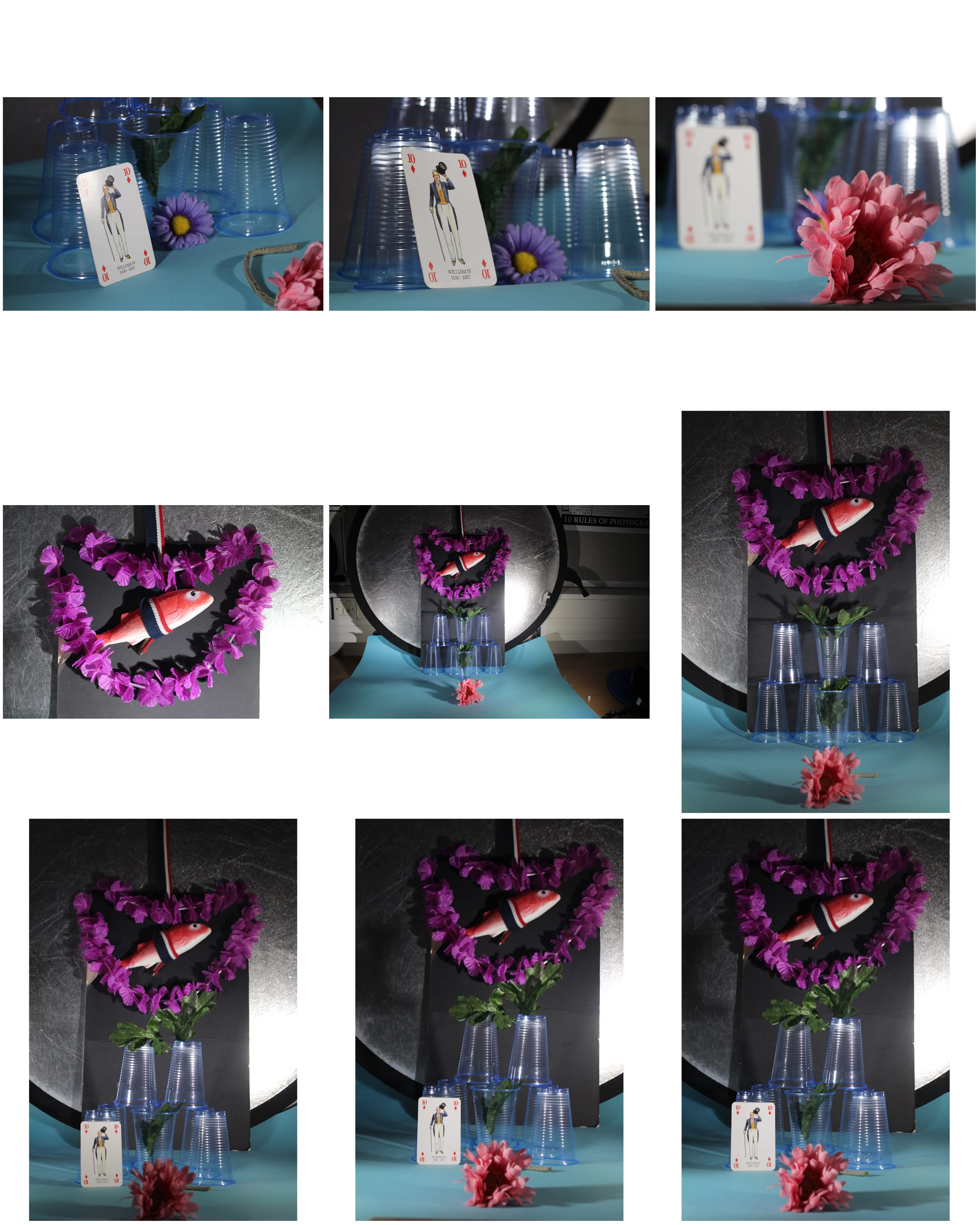
This week, we were introduced to the concept of still life photography and the wide array of creative possibilities, evident in work by the likes of Edward Weston and Martin Parr. We were given a box of random objects, such as plastic fish and playing cards, as well as lighting equipment in order to create a scene and experiment with how our scene was constructed and lit. I felt like, from this workshop, I was able to engage with different lighting setups and how they affect the image much more, at a better level. Also, I could think in a more abstract manner about how my image was constructed and how objects were placed within the frame to make it visually dynamic and more intriguing.
Task 2: Week 2
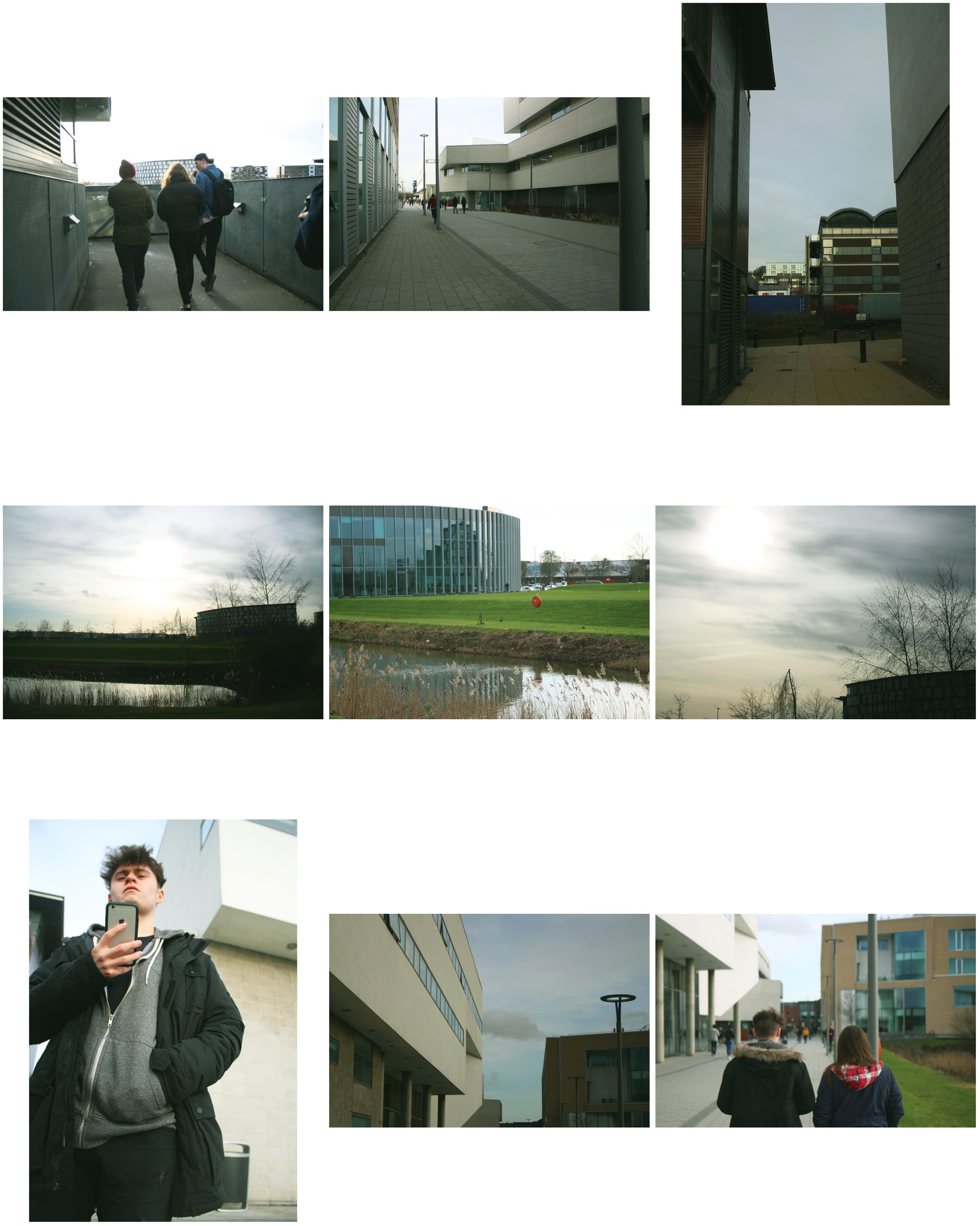
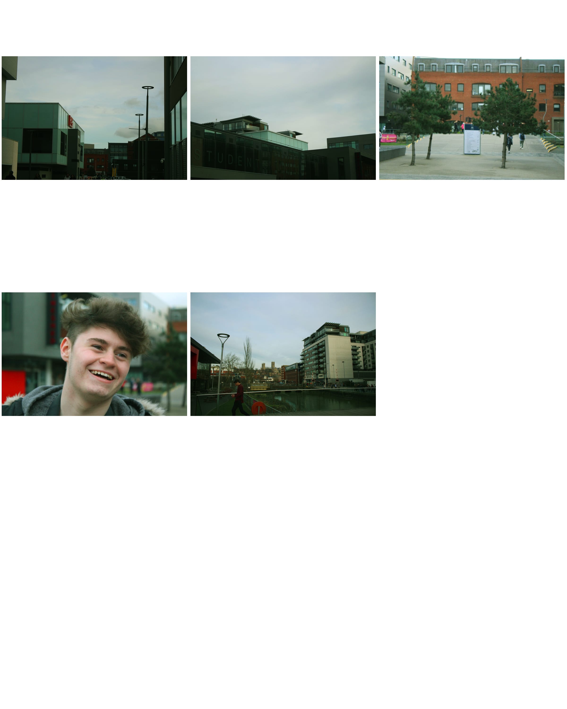
This week, we wandered around our university campus, capturing the world around us and experimenting with the camera settings.
Images In The Wild
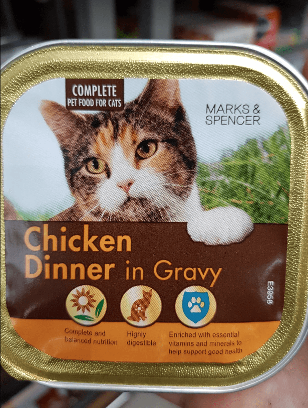
I was drawn to this image on M&S cat food packaging because it is typical of the style of imagery usually found on this type of packaging. The main aspect that caught me was how the cat seemed to be holding onto the packaging with its paw, suggesting that your pet itself would choose to have this food, meaning it will be pleasing and appetising for your cat. The background setting appears to be in a field with tall, bright-green grass; portraying a positive, happy atmosphere with connotations that this food will bring happiness and health to your cat.
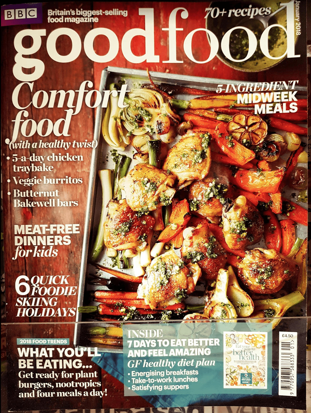
This particular image appealed to me predominantly because of the crisp, vibrant colours it displays to the viewer. The dish shown on the cover is aesthetically pleasing to look at, thus enticing food fanatics and aspiring chefs to consume the magazine. Because there is minimal text overlaying the dish, it is the main subject of the image and it is the first aspect that draws the consumer in. I believe it is included to portray the end goal to the viewer, with the message being that if you buy this magazine and follow the tips and tricks offered, you can make a dish just like the one shown.
Leave a comment